#4 Color with Care
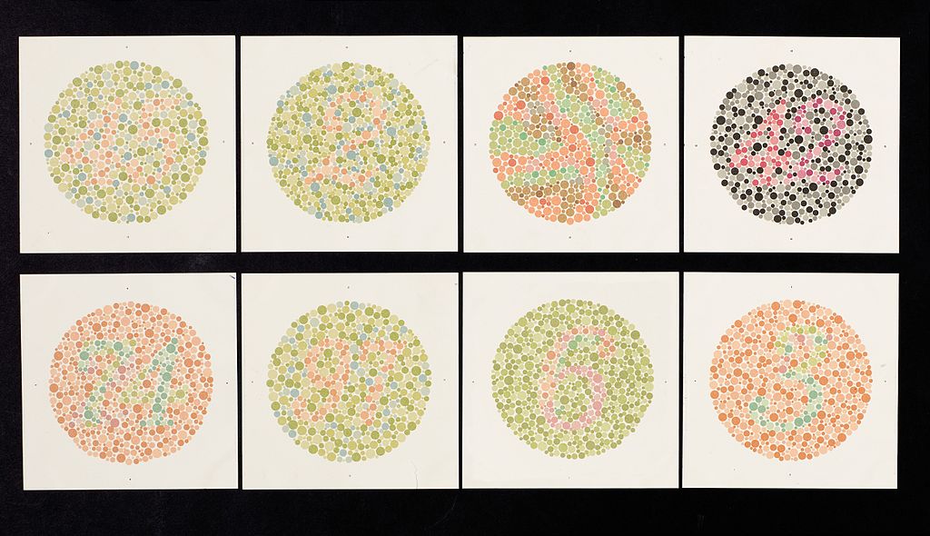
The use of color can affect how readable a page is for students with vision disabilities. For instance, color-blind individuals have a hard time discriminating between specific colors and hues. Therefore, you should never rely solely on color to convey information (using red to indicate homework and green to indicate readings). Color should instead be used to compliment what is already implied in your text.
If you must use color, make sure there is considerable contrast between the background and text colors. You should also limit how many colors you use on your page to help alleviate confusion for students with vision impairments.
The image below shows how color-blindness can affect what information a person sees.